Digital transformation still has a long way to go before becoming ubiquitous in society and companies. The belief that all the market is fully on digital mode, is actually a myth.
B2B relations might consider more environmental, social issues in their procurement and compliance processes;
Core business technological reinvention is an unavoidable must. Really. At last.
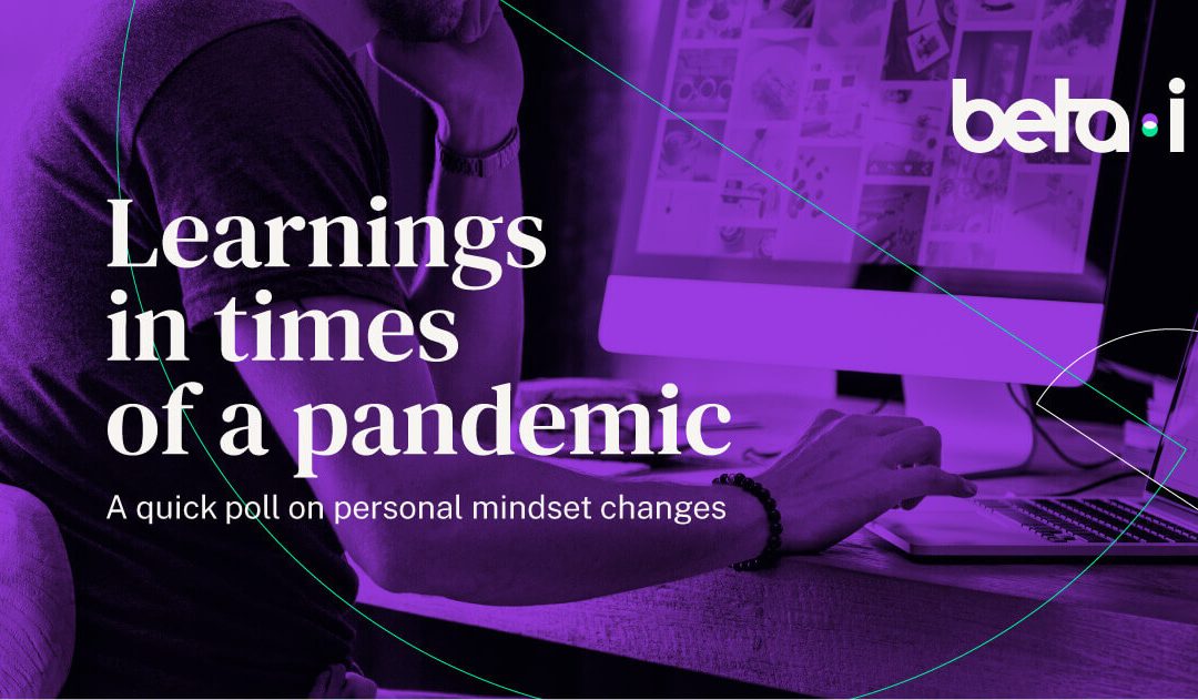
These are some of the key impressions from “Learnings in times of a pandemic – A quick poll on personal mindset changes” ran by Beta-i during the peak of quarantine and self-isolation stress in Europe (May to June). We’ve asked some of our corporate clients, closest startups and other stakeholders (investors, think tanks) about these new perspectives. And you can access the full results here:
UX Design is trending everywhere, and it’s no wonder – a comprehensive report on the impact of UX Design has shown that companies which invested the most, and who considered themselves to be fully user-centric, saw their sales increase by a staggering 75%.
Effectively, sales are one of the ways to measure the success of a design – but not the only. It can also be measured by other KPIs – such as retention or even the completion of a task – that can tell the designer if the experience if effective or not.
While designing, there are a few principles that can be followed to guarantee a better experience for the user, mostly used for interface design but also applicable to any kind of experience.
They are called heuristics and they represent cognitive shortcuts or rules of thumb that simplify decisions, and represent a process of substituting a difficult question with an easier one.
The 10 usability heuristics
1. Keep users in the know
The system should always keep users informed about what is going on, through appropriate feedback within reasonable time.
Have you ever unsuccessfully tried to upload something without knowing if it’s being uploaded or not? No? That’s because the designers understand the “Visibility of system status“, which means giving the user the understanding of the task completion – hence the existence of loading bars, or the sound of a message sent.
2. Make sure the user understands
The system should speak the users’ language, with words, phrases and concepts familiar to the user, rather than system-oriented terms. Follow real-world conventions, making information appear in a natural and logical order.
This rule is about matching the system and the real world – make the experience familiar to the user. That is why the trash icon on our computers is actually a trash bin.
3. Make an Exit Simple
Users often choose system functions by mistake and will need a clearly marked “emergency exit” to leave the unwanted state without having to go through an extended dialogue. Support undo and redo.
This is about giving your user control and freedom – to go back and alter the info on a form, to cancel an upload that is too heavy, to leave a task they don’t want to complete. Designers take it to the next level by helping us avoid or undo our mistakes – asking us if we’re sure we want to leave the page, or creating auto-saves that help us go to a previous version of our document.
4. Consistency and Standards
Users should not have to wonder whether different words, situations, or actions mean the same thing.
Consistency is key – to make the users experience easy, information of the same kind should not be presented in different ways. “Buy” buttons should look the same across a website. It’s also important to adhere to external conventions – profile settings are usually available in the top right corner, and FAQ pages look pretty much the same across different websites.
5. Error Prevention
Even better than good error messages is a careful design which prevents a problem from occurring in the first place. Either eliminate error-prone conditions or check for them and present users with a confirmation option before they commit to the action.
Designers can delight users by helping them to not make mistakes – that’s why google search helps you correct grammatical mistakes and gmail does not let you live through the embarrassment of sending a second email with a forgotten attachment.
6. Recognition not recall
Minimize the user’s memory load by making objects, actions, and options visible. The user should not have to remember information from one part of the dialogue to another. Instructions for use of the system should be visible or easily retrievable whenever appropriate.
Basically, don’t make users memorize things. Google search suggests similar searches and Amazon lets you see your recently browsed items and similar objects.
7. Flexibility for newbies and experts
Accelerators — unseen by the novice user — may often speed up the interaction for the expert user such that the system can cater to both inexperienced and experienced users. Allow users to tailor frequent actions.
Experiences must be doable for both newbies and experts – that’s why designers create shortcuts. Experience users will skip tutorials, but use advanced settings (usually partially hidden to not hinder newbies). In real life experiences, escape rooms usually add extra clues for newbies, to help them make logical connections that heavy users already know.
8. Aesthetically pleasant and efficient
Dialogues should not contain information which is irrelevant or rarely needed. Every extra unit of information in a dialogue competes with the relevant units of information and diminishes their relative visibility.
This guideline compels us to use only needed information. Interfaces need to be cleared of unnecessary elements and content that do not support the page goals and tasks, so this is where prioritization comes to play. This rule is also the reason very minimalistic design – like the one used by Google – is wildly successful.
9. Help users recognize, diagnose, and recover from errors
Error messages should be expressed in plain language (no codes), precisely indicate the problem, and constructively suggest a solution.
Have you have repeatedly try to submit a form that says some information is wrong but won’t tell you which information is wrong? Ideally the user should be informed accurately of what is wrong.
Another important layer is the identification of solutions – if the password is wrong, a good design would suggest you a link to password recovery.
10. Help and documentation
Even though it is better if the system can be used without documentation, it may be necessary to provide help and documentation. Any such information should be easy to search, focused on the user’s task, list concrete steps to be carried out, and not be too large.
Ideally, users should not need helpful documentation if the design is great. Still, it’s important to create useful documentation to clear any doubts. This documentation should be accessible and clearly structured to help users find the help they need.
Heuristics are a handy guide for UX Designers, as they mostly applicable to any web & mobile applications. You can also use them, or versions of it adapted to other types of experiences. The trick is to always put yourself in the user’s shoes!
Do I have your attention now? So, let’s explain it. Free Electrons is on its second edition and its main goal is to reach startups developing solutions in mobility, clean and smart energy and digitalization. In a week the startups will go through three acceleration modules between April and October 2018, those will take place in San Francisco and two other locations, one in Europe and the other in the Far East.
As you may have figured out by now, it’s an unique opportunity for startups in the energy sector to grow and develop their business. Still interested? Then apply until February 23, 2018. See you on the other side.